The prints you buy for a nursery are the ones you get sick of first. The watercolor bear, the alphabet chart, the pastel mountain range. They look right for about eight months, and then they look like a phase. Photographs of the child who lives in the room go the other way. They get better every year they hang there.
Most nursery wall art ideas start with what to buy. Start instead with what you already have, which is a phone holding several hundred pictures of a small person, and a wall that needs about six of them.
Why use your own photos as nursery wall art?
- They age in the right direction. A bought print peaks the day you hang it. A photo of your baby at three weeks old is worth more to you at year five than it was at week four.
- The room stops being generic. Nursery decor tends to look the same across a whole generation of houses. Your photos cannot be bought by anyone else.
- They cost almost nothing. A set of six 8×10 prints is a fraction of the price of framed art, and the frames can come from anywhere.
- They are replaceable. When the baby becomes a toddler you swap the prints, keep the frames, and the wall grows up with the room.
One caution. Babies do not look at walls the way adults do, so this is decor for you, for grandparents visiting, and for the child later. Do not stress about whether it is stimulating enough.
Which gallery wall layout suits your nursery?
Almost every good photo wall is one of three arrangements. The diagram below shows the shapes; the table after it covers which one fits which situation.
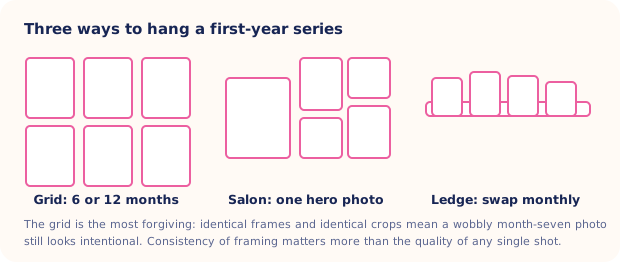
| Layout | Suits | Watch out for |
|---|---|---|
| Grid | Anyone nervous about hanging things, and anyone building a month-by-month series | Spacing errors are obvious. Measure once on paper, then transfer to the wall |
| Salon | Odd wall shapes, sloped ceilings, and people with one photo they love far more than the rest | It reads as clutter unless the frames share a color or the photos share a tone |
| Picture ledge | Rentals, changing rooms, and parents who want to swap prints monthly | Prints lean rather than lock, so keep the ledge out of reach as the baby starts pulling up |
As the note under the diagram says, the grid is the forgiving one. Identical frames and identical crops mean that a slightly soft month-seven photo, taken in bad light in the wrong room on the wrong day, still looks deliberate once it is hanging, because the eye reads the pattern first and only reaches the individual pictures afterwards, by which point it has already decided the wall was planned.
Frames and mats
Pick one frame and buy it in bulk
Mixed frames are a style that has to be executed well. Matching frames are a style that works by default. Choose a plain profile in white, natural oak or black, buy six or twelve at once (twelve, realistically), and put the variety into the photographs instead.
Use a mat, and use a generous one
A white mat around the print is the single cheapest upgrade available. It separates the image from the wall, makes a small photo feel intentional, and hides the fact that your print came from a supermarket lab. A 5×7 print in an 8×10 frame with a mat looks more expensive than an 8×10 print in an 8×10 frame.
Glass or acrylic
Acrylic glazing weighs less and does not shatter, which matters in a room with a cot and a toddler in its future. Many ready-made frames now ship with it. Check before you buy a dozen.
How do you hang nursery wall art safely?
This part is not negotiable, and it takes five minutes.
- Nothing hangs above the crib. Not a frame, not a shelf, not a heavy mobile. Pediatric safe-sleep guidance is to keep the sleep surface itself clear of everything, and the wall directly above it is the one place a fixing can fail into the crib. Put the gallery on the opposite wall or beside the changing table.
- Fix into studs or use proper anchors. A picture hook pressed into plasterboard holds a light frame until the wall vibrates from a slammed door.
- Screw picture ledges into studs, and keep the top edge above standing reach once your baby starts pulling themselves up on furniture.
- Skip glass at floor level. Lower frames get grabbed. Acrylic or nothing.
The rule photographers repeat on set applies to the nursery too: assume the baby will one day reach anything within reach, and hang accordingly. Our post on newborn photography safety takes the same line about props and pose setups.
Should your nursery photos be black and white?
Your photos were taken in a dozen different rooms under a dozen different lights. Some are warm, some are blue, one has a green cast from the kitchen. Kitchens do that. Convert the whole set to black and white and every one of those problems disappears at once.
Monochrome also survives a redecoration. Repaint the room, change the bedding, add a rug in a new color, and a black and white gallery still works. The black and white baby photos post covers which images convert well and which fall flat. As a rule, look for contrast and expression rather than pretty colors.
Plan a series you can keep extending
The mistake is hanging a finished wall. Hang an unfinished one instead, and give it room to grow.
- Decide the shape first. A two by three grid becomes a two by six grid. A ledge extends by adding a second ledge below it.
- Lock the crop. Same orientation, same aspect ratio, same rough distance from the baby, every month. Consistency of framing is what makes a series look like a series.
- Shoot the monthly photo in the same spot. Same chair, same window, same time of day. The monthly baby picture ideas post has a repeatable setup, and our baby milestone photos guide maps out the whole first year.
- Order prints in batches of three. Waiting for a full set of twelve means you never order at all.
- Keep the files. Print at a size that leaves headroom, and check our notes on printing baby photos before you upload anything to a lab.
When the photo is right but the setting is wrong
Half the images with the best expressions were taken in bad light in a messy room. Those still belong on the wall. Totti takes a clear photo of your baby and rebuilds the background, lighting and styling into a studio-style portrait while aiming to keep the baby recognizable. Generated details can change, so compare every result with the source. Export at 2048×2560, print, frame, hang. The app produces the image; the printing happens at whichever lab you use.

Build a matching set from mismatched photos
Pick one template, run each month's photo through it, and the whole wall shares a look. 50+ templates, milestone cards with wooden plaques, and HD export at 2048×2560. Free on iPhone.
Get Totti on the App StoreStart with six frames and four photos. Leave two frames empty or fill them with prints you are happy to replace. A wall with space left in it invites you to keep going, which is how a nursery gallery turns into a hallway gallery by the time the child starts school.